Note
Go to the end to download the full example code.
EstimatorReport: Get insights from any scikit-learn estimator#
This example shows how the skore.EstimatorReport class can be used to
quickly get insights from any scikit-learn estimator.
Loading our dataset and defining our estimator#
First, we load a dataset from skrub. Our goal is to predict if a healthcare manufacturing companies paid a medical doctors or hospitals, in order to detect potential conflict of interest.
from skrub.datasets import fetch_open_payments

dataset = fetch_open_payments()
df = dataset.X
y = dataset.y
Downloading 'open_payments' from https://github.com/skrub-data/skrub-data-files/raw/refs/heads/main/open_payments.zip (attempt 1/3)
from skrub import TableReport

TableReport(df)
| Applicable_Manufacturer_or_Applicable_GPO_Making_Payment_Name | Dispute_Status_for_Publication | Name_of_Associated_Covered_Device_or_Medical_Supply1 | Name_of_Associated_Covered_Drug_or_Biological1 | Physician_Specialty | |
|---|---|---|---|---|---|
| 0 | ELI LILLY AND COMPANY | No | Allopathic & Osteopathic Physicians|Pediatrics|Pediatric Rheumatology | ||
| 1 | ELI LILLY AND COMPANY | No | Allopathic & Osteopathic Physicians|Internal Medicine|Nephrology | ||
| 2 | ELI LILLY AND COMPANY | No | Allopathic & Osteopathic Physicians|Internal Medicine|Rheumatology | ||
| 3 | ELI LILLY AND COMPANY | No | Allopathic & Osteopathic Physicians|Internal Medicine|Endocrinology, Diabetes & Metabolism | ||
| 4 | ELI LILLY AND COMPANY | No | EFFIENT | Allopathic & Osteopathic Physicians|Pediatrics|Pediatric Hematology-Oncology | |
| 73,553 | GlaxoSmithKline, LLC. | No | ZIAGEN | ||
| 73,554 | ALERE SCARBOROUGH, INC. | No | Alere PBP2a | ||
| 73,555 | NovoCure Limited | No | |||
| 73,556 | Wright Medical Technology, Inc. | No | HIPS | ||
| 73,557 | Alcon Research Ltd | No | Express |
Applicable_Manufacturer_or_Applicable_GPO_Making_Payment_Name
ObjectDType- Null values
- 0 (0.0%)
- Unique values
-
1,466 (2.0%)
This column has a high cardinality (> 40).
Most frequent values
Dispute_Status_for_Publication
ObjectDType- Null values
- 0 (0.0%)
- Unique values
- 2 (< 0.1%)
Most frequent values
Name_of_Associated_Covered_Device_or_Medical_Supply1
ObjectDType- Null values
- 43,088 (58.6%)
- Unique values
-
4,372 (5.9%)
This column has a high cardinality (> 40).
Most frequent values
Name_of_Associated_Covered_Drug_or_Biological1
ObjectDType- Null values
- 36,233 (49.3%)
- Unique values
-
2,262 (3.1%)
This column has a high cardinality (> 40).
Most frequent values
Physician_Specialty
ObjectDType- Null values
- 3,996 (5.4%)
- Unique values
-
513 (0.7%)
This column has a high cardinality (> 40).
Most frequent values
No columns match the selected filter: . You can change the column filter in the dropdown menu above.
| Column | Column name | dtype | Is sorted | Null values | Unique values | Mean | Std | Min | Median | Max |
|---|---|---|---|---|---|---|---|---|---|---|
| 0 | Applicable_Manufacturer_or_Applicable_GPO_Making_Payment_Name | ObjectDType | False | 0 (0.0%) | 1466 (2.0%) | |||||
| 1 | Dispute_Status_for_Publication | ObjectDType | False | 0 (0.0%) | 2 (< 0.1%) | |||||
| 2 | Name_of_Associated_Covered_Device_or_Medical_Supply1 | ObjectDType | False | 43088 (58.6%) | 4372 (5.9%) | |||||
| 3 | Name_of_Associated_Covered_Drug_or_Biological1 | ObjectDType | False | 36233 (49.3%) | 2262 (3.1%) | |||||
| 4 | Physician_Specialty | ObjectDType | False | 3996 (5.4%) | 513 (0.7%) |
No columns match the selected filter: . You can change the column filter in the dropdown menu above.
Applicable_Manufacturer_or_Applicable_GPO_Making_Payment_Name
ObjectDType- Null values
- 0 (0.0%)
- Unique values
-
1,466 (2.0%)
This column has a high cardinality (> 40).
Most frequent values
Dispute_Status_for_Publication
ObjectDType- Null values
- 0 (0.0%)
- Unique values
- 2 (< 0.1%)
Most frequent values
Name_of_Associated_Covered_Device_or_Medical_Supply1
ObjectDType- Null values
- 43,088 (58.6%)
- Unique values
-
4,372 (5.9%)
This column has a high cardinality (> 40).
Most frequent values
Name_of_Associated_Covered_Drug_or_Biological1
ObjectDType- Null values
- 36,233 (49.3%)
- Unique values
-
2,262 (3.1%)
This column has a high cardinality (> 40).
Most frequent values
Physician_Specialty
ObjectDType- Null values
- 3,996 (5.4%)
- Unique values
-
513 (0.7%)
This column has a high cardinality (> 40).
Most frequent values
No columns match the selected filter: . You can change the column filter in the dropdown menu above.
| Column 1 | Column 2 | Cramér's V | Pearson's Correlation |
|---|---|---|---|
| Name_of_Associated_Covered_Device_or_Medical_Supply1 | Name_of_Associated_Covered_Drug_or_Biological1 | 0.263 | |
| Applicable_Manufacturer_or_Applicable_GPO_Making_Payment_Name | Name_of_Associated_Covered_Drug_or_Biological1 | 0.214 | |
| Applicable_Manufacturer_or_Applicable_GPO_Making_Payment_Name | Name_of_Associated_Covered_Device_or_Medical_Supply1 | 0.132 | |
| Name_of_Associated_Covered_Device_or_Medical_Supply1 | Physician_Specialty | 0.0962 | |
| Dispute_Status_for_Publication | Physician_Specialty | 0.0960 | |
| Dispute_Status_for_Publication | Name_of_Associated_Covered_Drug_or_Biological1 | 0.0895 | |
| Name_of_Associated_Covered_Drug_or_Biological1 | Physician_Specialty | 0.0646 | |
| Applicable_Manufacturer_or_Applicable_GPO_Making_Payment_Name | Physician_Specialty | 0.0510 | |
| Applicable_Manufacturer_or_Applicable_GPO_Making_Payment_Name | Dispute_Status_for_Publication | 0.0308 | |
| Dispute_Status_for_Publication | Name_of_Associated_Covered_Device_or_Medical_Supply1 | 0.0284 |
Please enable javascript
The skrub table reports need javascript to display correctly. If you are displaying a report in a Jupyter notebook and you see this message, you may need to re-execute the cell or to trust the notebook (button on the top right or "File > Trust notebook").
Looking at the distributions of the target, we observe that this classification task is quite imbalanced. It means that we have to be careful when selecting a set of statistical metrics to evaluate the classification performance of our predictive model. In addition, we see that the class labels are not specified by an integer 0 or 1 but instead by a string “allowed” or “disallowed”.
For our application, the label of interest is “allowed”.
Now, we need to define a predictive model. Thankfully, skrub provides a convenient
function (skrub.tabular_pipeline()) when it comes to getting strong baseline
predictive models with a single line of code. As its feature engineering is generic,
it does not provide some handcrafted and tailored feature engineering but still
provides a good starting point.
So let’s create a classifier for our task.
from skrub import tabular_pipeline

estimator = tabular_pipeline("classifier")
estimator
Getting insights from our estimator#
Introducing the skore.EstimatorReport class#
Now, we would be interested in getting some insights from our predictive model.
One way is to use the skore.EstimatorReport class which we will
construct using the evaluate function. This function will detect that our
estimator is unfitted and will fit it for us on the training data and return an
EstimatorReport object.
Specifying a splitter of 0.2 will perform a 80/20 train-test split.
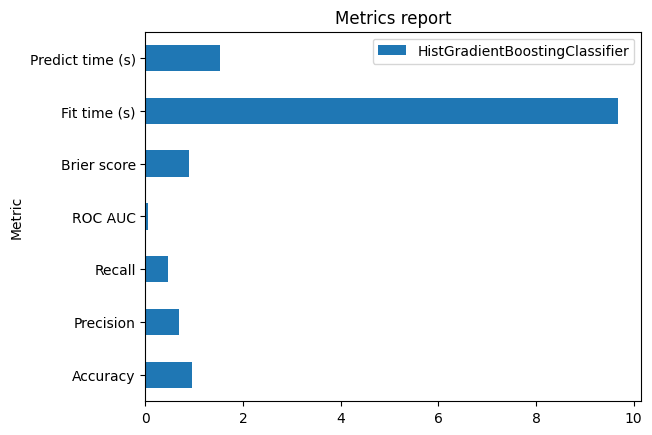
| Metric | HistGradientBoostingClassifier |
|---|---|
| Score | 0.951536 |
| Accuracy | 0.951536 |
| Precision | 0.736842 |
| Recall | 0.447552 |
| ROC AUC | 0.938427 |
| Log loss | 0.131869 |
| Brier score | 0.037143 |
| Fit time (s) | 10.358522 |
| Predict time (s) | 1.285694 |
Pipeline(steps=[('tablevectorizer',
                 TableVectorizer(low_cardinality=ToCategorical())),
                ('histgradientboostingclassifier',
HistGradientBoostingClassifier())])In a Jupyter environment, please rerun this cell to show the HTML representation or trust the notebook. On GitHub, the HTML representation is unable to render, please try loading this page with nbviewer.org.
Parameters
Fitted attributes
Parameters
| low_cardinality | ToCategorical() | |
| high_cardinality | StringEncoder() | |
| numeric | PassThrough() | |
| datetime | DatetimeEncoder() | |
| cardinality_threshold | 40 | |
| specific_transformers | () | |
| drop_null_fraction | 1.0 | |
| drop_if_constant | False | |
| drop_if_unique | False | |
| datetime_format | None | |
| null_strings | None | |
| n_jobs | None |
Fitted attributes
| Name | Type | Value |
|---|---|---|
| all_outputs_ | list | ['Ap...00', 'Ap...01', 'Ap...02', 'Ap...03', ...] |
| all_processing_steps_ | dict | {'Ap...me': [CleanNullStrings(), DropUninformative(), ToStr(), StringEncoder(), ...], 'Di...on': [CleanNullStrings(), DropUninformative(), ToStr(), ToCategorical()], 'Na...y1': [CleanNullStrings(), DropUninformative(), ToStr(), StringEncoder(), ...], 'Na...l1': [CleanNullStrings(), DropUninformative(), ToStr(), StringEncoder(), ...], ...} |
| column_to_kind_ | dict | {'Ap...me': 'hi...ty', 'Di...on': 'lo...ty', 'Na...y1': 'hi...ty', 'Na...l1': 'hi...ty', ...} |
| feature_names_in_ | list | ['Ap...me', 'Di...on', 'Na...y1', 'Na...l1', ...] |
| input_to_outputs_ | dict | {'Ap...me': ['Ap...00', 'Ap...01', 'Ap...02', 'Ap...03', ...], 'Di...on': ['Di...on'], 'Na...y1': ['Na...00', 'Na...01', 'Na...02', 'Na...03', ...], 'Na...l1': ['Na...00', 'Na...01', 'Na...02', 'Na...03', ...], ...} |
| kind_to_columns_ | dict | {'da...me': [], 'hi...ty': ['Ap...me', 'Na...y1', 'Na...l1', 'Ph...ty'], 'lo...ty': ['Di...on'], 'numeric': [], ...} |
| n_features_in_ | int | 5 |
| output_to_input_ | dict | {'Ap...00': 'Ap...me', 'Ap...01': 'Ap...me', 'Ap...02': 'Ap...me', 'Ap...03': 'Ap...me', ...} |
| transformers_ | dict | {'Ap...me': StringEncoder(), 'Di...on': ToCategorical(), 'Na...y1': StringEncoder(), 'Na...l1': StringEncoder(), ...} |
Parameters
Parameters
| resolution | 'hour' | |
| add_weekday | False | |
| add_total_seconds | True | |
| add_day_of_year | False | |
| periodic_encoding | None |
['Dispute_Status_for_Publication']
Parameters
['Applicable_Manufacturer_or_Applicable_GPO_Making_Payment_Name', 'Name_of_Associated_Covered_Device_or_Medical_Supply1', 'Name_of_Associated_Covered_Drug_or_Biological1', 'Physician_Specialty']
Parameters
| n_components | 30 | |
| vectorizer | 'tfidf' | |
| ngram_range | (3, ...) | |
| analyzer | 'char_wb' | |
| stop_words | None | |
| random_state | None | |
| vocabulary | None |
121 features
| Applicable_Manufacturer_or_Applicable_GPO_Making_Payment_Name_00 |
| Applicable_Manufacturer_or_Applicable_GPO_Making_Payment_Name_01 |
| Applicable_Manufacturer_or_Applicable_GPO_Making_Payment_Name_02 |
| Applicable_Manufacturer_or_Applicable_GPO_Making_Payment_Name_03 |
| Applicable_Manufacturer_or_Applicable_GPO_Making_Payment_Name_04 |
| Applicable_Manufacturer_or_Applicable_GPO_Making_Payment_Name_05 |
| Applicable_Manufacturer_or_Applicable_GPO_Making_Payment_Name_06 |
| Applicable_Manufacturer_or_Applicable_GPO_Making_Payment_Name_07 |
| Applicable_Manufacturer_or_Applicable_GPO_Making_Payment_Name_08 |
| Applicable_Manufacturer_or_Applicable_GPO_Making_Payment_Name_09 |
| Applicable_Manufacturer_or_Applicable_GPO_Making_Payment_Name_10 |
| Applicable_Manufacturer_or_Applicable_GPO_Making_Payment_Name_11 |
| Applicable_Manufacturer_or_Applicable_GPO_Making_Payment_Name_12 |
| Applicable_Manufacturer_or_Applicable_GPO_Making_Payment_Name_13 |
| Applicable_Manufacturer_or_Applicable_GPO_Making_Payment_Name_14 |
| Applicable_Manufacturer_or_Applicable_GPO_Making_Payment_Name_15 |
| Applicable_Manufacturer_or_Applicable_GPO_Making_Payment_Name_16 |
| Applicable_Manufacturer_or_Applicable_GPO_Making_Payment_Name_17 |
| Applicable_Manufacturer_or_Applicable_GPO_Making_Payment_Name_18 |
| Applicable_Manufacturer_or_Applicable_GPO_Making_Payment_Name_19 |
| Applicable_Manufacturer_or_Applicable_GPO_Making_Payment_Name_20 |
| Applicable_Manufacturer_or_Applicable_GPO_Making_Payment_Name_21 |
| Applicable_Manufacturer_or_Applicable_GPO_Making_Payment_Name_22 |
| Applicable_Manufacturer_or_Applicable_GPO_Making_Payment_Name_23 |
| Applicable_Manufacturer_or_Applicable_GPO_Making_Payment_Name_24 |
| Applicable_Manufacturer_or_Applicable_GPO_Making_Payment_Name_25 |
| Applicable_Manufacturer_or_Applicable_GPO_Making_Payment_Name_26 |
| Applicable_Manufacturer_or_Applicable_GPO_Making_Payment_Name_27 |
| Applicable_Manufacturer_or_Applicable_GPO_Making_Payment_Name_28 |
| Applicable_Manufacturer_or_Applicable_GPO_Making_Payment_Name_29 |
| Dispute_Status_for_Publication |
| Name_of_Associated_Covered_Device_or_Medical_Supply1_00 |
| Name_of_Associated_Covered_Device_or_Medical_Supply1_01 |
| Name_of_Associated_Covered_Device_or_Medical_Supply1_02 |
| Name_of_Associated_Covered_Device_or_Medical_Supply1_03 |
| Name_of_Associated_Covered_Device_or_Medical_Supply1_04 |
| Name_of_Associated_Covered_Device_or_Medical_Supply1_05 |
| Name_of_Associated_Covered_Device_or_Medical_Supply1_06 |
| Name_of_Associated_Covered_Device_or_Medical_Supply1_07 |
| Name_of_Associated_Covered_Device_or_Medical_Supply1_08 |
| Name_of_Associated_Covered_Device_or_Medical_Supply1_09 |
| Name_of_Associated_Covered_Device_or_Medical_Supply1_10 |
| Name_of_Associated_Covered_Device_or_Medical_Supply1_11 |
| Name_of_Associated_Covered_Device_or_Medical_Supply1_12 |
| Name_of_Associated_Covered_Device_or_Medical_Supply1_13 |
| Name_of_Associated_Covered_Device_or_Medical_Supply1_14 |
| Name_of_Associated_Covered_Device_or_Medical_Supply1_15 |
| Name_of_Associated_Covered_Device_or_Medical_Supply1_16 |
| Name_of_Associated_Covered_Device_or_Medical_Supply1_17 |
| Name_of_Associated_Covered_Device_or_Medical_Supply1_18 |
| Name_of_Associated_Covered_Device_or_Medical_Supply1_19 |
| Name_of_Associated_Covered_Device_or_Medical_Supply1_20 |
| Name_of_Associated_Covered_Device_or_Medical_Supply1_21 |
| Name_of_Associated_Covered_Device_or_Medical_Supply1_22 |
| Name_of_Associated_Covered_Device_or_Medical_Supply1_23 |
| Name_of_Associated_Covered_Device_or_Medical_Supply1_24 |
| Name_of_Associated_Covered_Device_or_Medical_Supply1_25 |
| Name_of_Associated_Covered_Device_or_Medical_Supply1_26 |
| Name_of_Associated_Covered_Device_or_Medical_Supply1_27 |
| Name_of_Associated_Covered_Device_or_Medical_Supply1_28 |
| Name_of_Associated_Covered_Device_or_Medical_Supply1_29 |
| Name_of_Associated_Covered_Drug_or_Biological1_00 |
| Name_of_Associated_Covered_Drug_or_Biological1_01 |
| Name_of_Associated_Covered_Drug_or_Biological1_02 |
| Name_of_Associated_Covered_Drug_or_Biological1_03 |
| Name_of_Associated_Covered_Drug_or_Biological1_04 |
| Name_of_Associated_Covered_Drug_or_Biological1_05 |
| Name_of_Associated_Covered_Drug_or_Biological1_06 |
| Name_of_Associated_Covered_Drug_or_Biological1_07 |
| Name_of_Associated_Covered_Drug_or_Biological1_08 |
| Name_of_Associated_Covered_Drug_or_Biological1_09 |
| Name_of_Associated_Covered_Drug_or_Biological1_10 |
| Name_of_Associated_Covered_Drug_or_Biological1_11 |
| Name_of_Associated_Covered_Drug_or_Biological1_12 |
| Name_of_Associated_Covered_Drug_or_Biological1_13 |
| Name_of_Associated_Covered_Drug_or_Biological1_14 |
| Name_of_Associated_Covered_Drug_or_Biological1_15 |
| Name_of_Associated_Covered_Drug_or_Biological1_16 |
| Name_of_Associated_Covered_Drug_or_Biological1_17 |
| Name_of_Associated_Covered_Drug_or_Biological1_18 |
| Name_of_Associated_Covered_Drug_or_Biological1_19 |
| Name_of_Associated_Covered_Drug_or_Biological1_20 |
| Name_of_Associated_Covered_Drug_or_Biological1_21 |
| Name_of_Associated_Covered_Drug_or_Biological1_22 |
| Name_of_Associated_Covered_Drug_or_Biological1_23 |
| Name_of_Associated_Covered_Drug_or_Biological1_24 |
| Name_of_Associated_Covered_Drug_or_Biological1_25 |
| Name_of_Associated_Covered_Drug_or_Biological1_26 |
| Name_of_Associated_Covered_Drug_or_Biological1_27 |
| Name_of_Associated_Covered_Drug_or_Biological1_28 |
| Name_of_Associated_Covered_Drug_or_Biological1_29 |
| Physician_Specialty_00 |
| Physician_Specialty_01 |
| Physician_Specialty_02 |
| Physician_Specialty_03 |
| Physician_Specialty_04 |
| Physician_Specialty_05 |
| Physician_Specialty_06 |
| Physician_Specialty_07 |
| Physician_Specialty_08 |
| Physician_Specialty_09 |
| Physician_Specialty_10 |
| Physician_Specialty_11 |
| Physician_Specialty_12 |
| Physician_Specialty_13 |
| Physician_Specialty_14 |
| Physician_Specialty_15 |
| Physician_Specialty_16 |
| Physician_Specialty_17 |
| Physician_Specialty_18 |
| Physician_Specialty_19 |
| Physician_Specialty_20 |
| Physician_Specialty_21 |
| Physician_Specialty_22 |
| Physician_Specialty_23 |
| Physician_Specialty_24 |
| Physician_Specialty_25 |
| Physician_Specialty_26 |
| Physician_Specialty_27 |
| Physician_Specialty_28 |
| Physician_Specialty_29 |
Parameters
Fitted attributes
| Applicable_Manufacturer_or_Applicable_GPO_Making_Payment_Name | Dispute_Status_for_Publication | Name_of_Associated_Covered_Device_or_Medical_Supply1 | Name_of_Associated_Covered_Drug_or_Biological1 | Physician_Specialty | status | |
|---|---|---|---|---|---|---|
| 0 | GC America Inc. | No | Restorative, Dental | allowed | ||
| 1 | Bayer HealthCare LLC | No | Jetstream | Respiratory, Developmental, Rehabilitative and Restorative Service Providers|Orthotic Fitter | disallowed | |
| 2 | Smith & Nephew, Inc. | No | Regranex | Allopathic & Osteopathic Physicians|Family Medicine | disallowed | |
| 3 | ViiV Healthcare Company | No | ZIAGEN | Allopathic & Osteopathic Physicians|Internal Medicine|Infectious Disease | disallowed | |
| 4 | Covidien LP | No | Vascular | Allopathic & Osteopathic Physicians|Colon & Rectal Surgery | disallowed | |
| 73,553 | Carl Zeiss Meditec, Inc. | No | Allopathic & Osteopathic Physicians|Otolaryngology|Otolaryngology/Facial Plastic Surgery | disallowed | ||
| 73,554 | Novo Nordisk Inc | No | Victoza | Allopathic & Osteopathic Physicians|Preventive Medicine|Public Health & General Preventive Medicine | disallowed | |
| 73,555 | Tactile Systems Technology Inc | No | Flexitouch | Allopathic & Osteopathic Physicians|Radiology|Radiation Oncology | disallowed | |
| 73,556 | Cook Incorporated | No | OHNS - Biodesign | Speech, Language and Hearing Service Providers|Audiologist-Hearing Aid Fitter | disallowed | |
| 73,557 | Boston Scientific Corporation | No | METAL STENTS G.I. | Allopathic & Osteopathic Physicians|Surgery | disallowed |
Applicable_Manufacturer_or_Applicable_GPO_Making_Payment_Name
ObjectDType- Null values
- 0 (0.0%)
- Unique values
-
1,466 (2.0%)
This column has a high cardinality (> 40).
Dispute_Status_for_Publication
ObjectDType- Null values
- 0 (0.0%)
- Unique values
- 2 (< 0.1%)
Name_of_Associated_Covered_Device_or_Medical_Supply1
ObjectDType- Null values
- 43,088 (58.6%)
- Unique values
-
4,372 (5.9%)
This column has a high cardinality (> 40).
Name_of_Associated_Covered_Drug_or_Biological1
ObjectDType- Null values
- 36,233 (49.3%)
- Unique values
-
2,262 (3.1%)
This column has a high cardinality (> 40).
Physician_Specialty
ObjectDType- Null values
- 3,996 (5.4%)
- Unique values
-
513 (0.7%)
This column has a high cardinality (> 40).
status
ObjectDType- Null values
- 0 (0.0%)
- Unique values
- 2 (< 0.1%)
No columns match the selected filter: . You can change the column filter in the dropdown menu above.
| Column | Column name | dtype | Is sorted | Null values | Unique values | Mean | Std | Min | Median | Max |
|---|---|---|---|---|---|---|---|---|---|---|
| 0 | Applicable_Manufacturer_or_Applicable_GPO_Making_Payment_Name | ObjectDType | False | 0 (0.0%) | 1466 (2.0%) | |||||
| 1 | Dispute_Status_for_Publication | ObjectDType | False | 0 (0.0%) | 2 (< 0.1%) | |||||
| 2 | Name_of_Associated_Covered_Device_or_Medical_Supply1 | ObjectDType | False | 43088 (58.6%) | 4372 (5.9%) | |||||
| 3 | Name_of_Associated_Covered_Drug_or_Biological1 | ObjectDType | False | 36233 (49.3%) | 2262 (3.1%) | |||||
| 4 | Physician_Specialty | ObjectDType | False | 3996 (5.4%) | 513 (0.7%) | |||||
| 5 | status | ObjectDType | False | 0 (0.0%) | 2 (< 0.1%) |
No columns match the selected filter: . You can change the column filter in the dropdown menu above.
Please enable javascript
The skrub table reports need javascript to display correctly. If you are displaying a report in a Jupyter notebook and you see this message, you may need to re-execute the cell or to trust the notebook (button on the top right or "File > Trust notebook").
Once the report is created, we get some information regarding the available tools
allowing us to get some insights from our specific model on our specific task by
calling the help() method.
Be aware that we can access the help for each individual sub-accessor. For instance:
report.metrics.help()
Metrics computation with aggressive caching#
At this point, we might be interested to have a first look at the statistical
performance of our model on the validation set that we provided. We can access it
by calling any of the metrics displayed above. Since we are greedy, we want to get
several metrics at once and we will use the
summarize() method.
import time

start = time.time()
metric_report = report.metrics.summarize().frame()
end = time.time()
metric_report
Time taken to compute the metrics: 0.00 seconds
An interesting feature provided by the skore.EstimatorReport is the
the caching mechanism. Indeed, when we have a large enough dataset, computing the
predictions for a model is not cheap anymore. For instance, on our smallish dataset,
it took a couple of seconds to compute the metrics. The report will cache the
predictions and if we are interested in computing a metric again or an alternative
metric that requires the same predictions, it will be faster. Let’s check by
requesting the same metrics report again.
start = time.time()
metric_report = report.metrics.summarize().frame()
end = time.time()
metric_report
Time taken to compute the metrics: 0.00 seconds
Note that when the model is fitted or the predictions are computed, we additionally store the time the operation took:
report.metrics.timings()
{'fit_time': 10.358521977999999, 'predict_time_train': 4.985065397999961, 'predict_time_test': 1.2856944669999848}
Since we obtain a pandas dataframe, we can also use the plotting interface of pandas.
ax = metric_report.plot.barh()
_ = ax.set_title("Metrics report")
Whenever computing a metric, we check if the predictions are available in the cache and reload them if available. So for instance, let’s compute the log loss.
0.13186882167335673
Time taken to compute the log loss: 0.00 seconds
We can show that without initial cache, it would have taken more time to compute the log loss.
0.13186882167335673
Time taken to compute the log loss: 2.56 seconds
By default, the metrics are computed on the test set only. However, if a training set
is provided, we can also compute the metrics by specifying the data_source
parameter.
0.09572131415106928
Be aware that we can also benefit from the caching mechanism with our own custom
metrics. Skore only expects that we define our own metric function to take y_true
and y_pred as the first two positional arguments. It can take any other arguments.
Let’s see an example.
def operational_decision_cost(y_true, y_pred, amount):
    mask_true_positive = (y_true == pos_label) & (y_pred == pos_label)
    mask_true_negative = (y_true == neg_label) & (y_pred == neg_label)
    mask_false_positive = (y_true == neg_label) & (y_pred == pos_label)
    mask_false_negative = (y_true == pos_label) & (y_pred == neg_label)
    fraudulent_refuse = mask_true_positive.sum() * 50
    fraudulent_accept = -amount[mask_false_negative].sum()
    legitimate_refuse = mask_false_positive.sum() * -5
    legitimate_accept = (amount[mask_true_negative] * 0.02).sum()
    return fraudulent_refuse + fraudulent_accept + legitimate_refuse + legitimate_accept
In our use case, we have a operational decision to make that translate the classification outcome into a cost. It translate the confusion matrix into a cost matrix based on some amount linked to each sample in the dataset that are provided to us. Here, we randomly generate some amount as an illustration.
import numpy as np
from sklearn.metrics import make_scorer

rng = np.random.default_rng(42)
amount = rng.integers(low=100, high=1000, size=len(report.y_test))

report.metrics.add(metric=make_scorer(operational_decision_cost, amount=amount))

cost = report.metrics.summarize(metric="operational_decision_cost")
cost.frame()
By the way, skore caches the model predictions. It is really handy because it means that we can compute some additional metrics without having to recompute the the predictions.
report.metrics.summarize(
    metric=["precision", "recall", "operational_decision_cost"]
).frame()
Effortless one-liner plotting#
The skore.EstimatorReport class also implements a number of the most common
data science plots.
As for the metrics, we only provide the meaningful set of plots for the provided
estimator.
report.metrics.help()
Let’s start by plotting the ROC curve for our binary classification task.
display = report.metrics.roc()
display.plot()
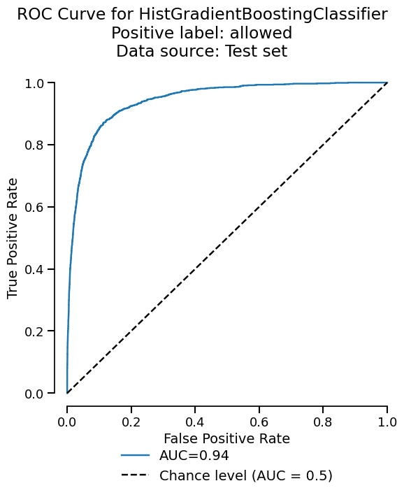
<Figure size 600x750 with 1 Axes>
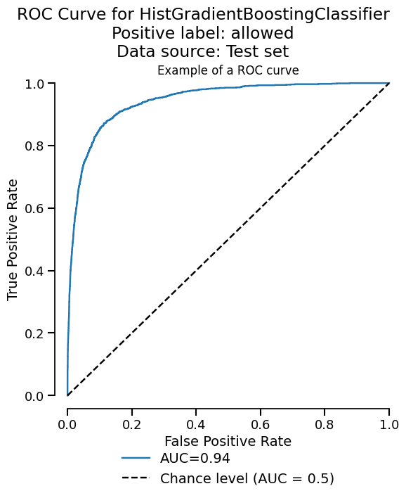
The plot functionality is built upon the scikit-learn display objects. We return
those display (slightly modified to improve the UI) in case we want to tweak some
of the plot properties. We can have quick look at the available attributes and
methods by calling the help method or simply by printing the display.
fig = display.plot()
fig.axes[0].set_title("Example of a ROC curve")
fig
<Figure size 600x750 with 1 Axes>
Similarly to the metrics, we aggressively use the caching to avoid recomputing the predictions of the model. We also cache the plot display object by detection if the input parameters are the same as the previous call. Let’s demonstrate the kind of performance gain we can get.

<Figure size 600x750 with 1 Axes>
Time taken to compute the ROC curve: 0.11 seconds
Now, let’s clean the cache and check if we get a slowdown.

<Figure size 600x750 with 1 Axes>
Time taken to compute the ROC curve: 2.71 seconds
As expected, since we need to recompute the predictions, it takes more time.
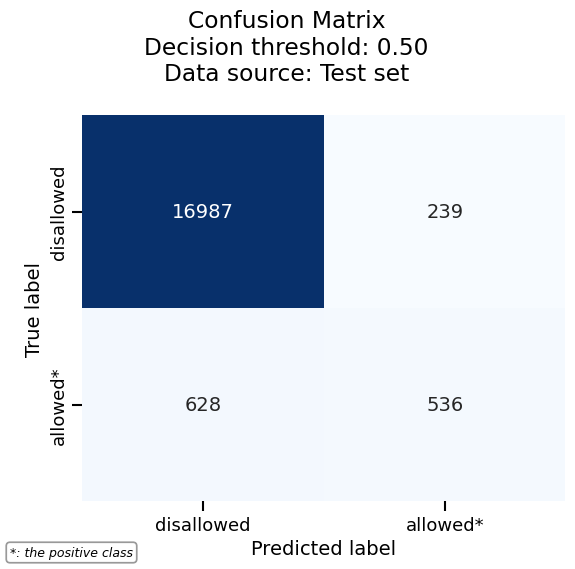
Visualizing the confusion matrix#
Another useful visualization for classification tasks is the confusion matrix, which shows the counts of correct and incorrect predictions for each class.
Let’s first start with a basic confusion matrix:
cm_display = report.metrics.confusion_matrix()
cm_display.plot()
<Figure size 600x600 with 1 Axes>
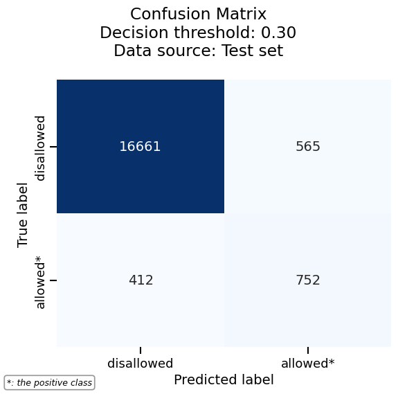
In binary classification, a confusion matrix depends on the decision threshold used to convert predicted probabilities into class labels. By default, skore uses a threshold of 0.5, but confusion matrices are actually computed at every threshold internally.
# To visualize the confusion matrix at a different threshold, use the
# ``threshold_value`` parameter. For example, a threshold of 0.3 will classify
# more samples as positive:
cm_display.plot(threshold_value=0.3)
<Figure size 600x600 with 1 Axes>
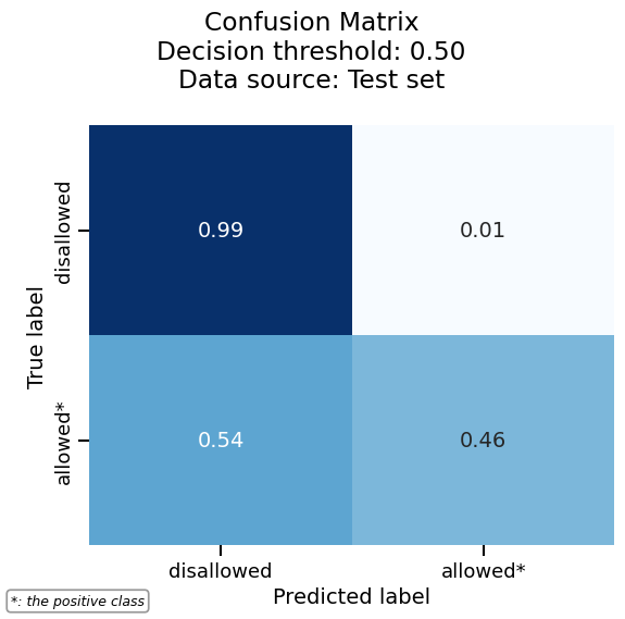
We can normalize the confusion matrix to get percentages instead of raw counts. Here we normalize by true labels (rows):
cm_display.plot(normalize="true")
<Figure size 600x600 with 1 Axes>
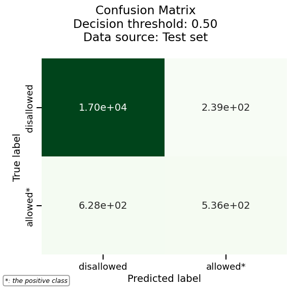
More plotting options are available via heatmap_kwargs, which are passed to
seaborn’s heatmap. For example, we can customize the colormap and number format:
cm_display.set_style(heatmap_kwargs={"cmap": "Greens", "fmt": ".2e"})
cm_display.plot()
<Figure size 600x600 with 1 Axes>
Finally, the confusion matrix can also be exported as a pandas DataFrame for further analysis:
See also
For using the EstimatorReport to inspect your models,
see EstimatorReport: Inspecting your models with the feature importance.
Total running time of the script: (1 minutes 5.916 seconds)