Visualization via the skore display API#
skore provides a family of objects that we call displays. All displays follow the
common API defined by the Display protocol. As a user, you get a display by
interacting with a reporter. Let’s provide an example:
from sklearn.datasets import make_classification
from sklearn.linear_model import LogisticRegression
from skore import evaluate

X, y = make_classification(
    n_samples=10_000,
    n_classes=3,
    class_sep=0.3,
    n_clusters_per_class=1,
    random_state=42,
)
report = evaluate(LogisticRegression(), X, y, splitter=5)
display = report.metrics.roc()
display.plot()
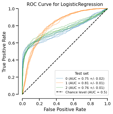
The EstimatorReport.metrics.roc() creates a RocCurveDisplay object.
The help method displays the available attributes and methods of the
display object interactively:
display.help()
Another available method is plot. It builds a matplotlib.figure.Figure
with the information contained in the display and returns that figure. In Jupyter,
leaving display.plot() as the last expression shows the figure automatically via its
representation; in a script, assign fig = display.plot(...) and call fig.show()
if needed. Call plot as many times as you want — it does not modify the display’s
underlying data nor require heavy computation.
display.plot()

The plot method can be preceded by the set_style method which accepts parameters to
tweak the rendering of the display. For instance, customize the appearance of the chance level:
display.set_style(
    chance_level_kwargs=dict(linestyle="-", linewidth=5, color="tab:purple")
)
display.plot()
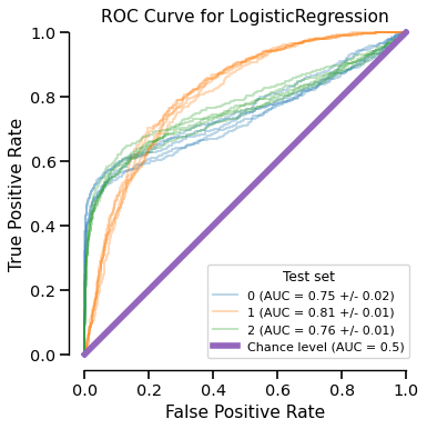
Any subsequent call to plot uses the style settings set by set_style.
The frame method retrieves the underlying data used to generate the plot as a
pandas.DataFrame:
df = display.frame()
df.head()