Note
Go to the end to download the full example code.
The skore API#
Skore has three types of reports: EstimatorReport
(single train-test evaluation), CrossValidationReport
(cross-validation), and ComparisonReport (comparing several
estimators). All three are created via evaluate() by passing an
estimator (or a list of estimators for comparison), the data X and y,
and a splitter that controls the evaluation strategy.
This example showcases the unified API shared by these reports: they expose
the same accessors (data, metrics, inspection). Methods that
produce a visualization return a Display object with plot(), frame(),
set_style(), and help().
Three report types, one API#
evaluate() returns one of three report types depending on its
splitter argument: an EstimatorReport when splitter is a
float or "prefit", a CrossValidationReport when splitter is
an integer or a scikit-learn cross-validator (e.g. KFold, StratifiedKFold),
or a ComparisonReport when passing a list of estimators.
All three respect the same accessor layout where applicable:
data: dataset analysis
metrics: performance metrics and related displays (e.g. ROC, confusion matrix)
inspection: model inspection (e.g. coefficients, feature importance)
The data accessor is not available on ComparisonReport because compared
models may use different input data; you can still inspect each underlying report.
Methods on these accessors return Display objects with a common interface.
First report: single train-test split#
We call evaluate() with the default splitter=0.2 to get an
EstimatorReport. The accessors and display API shown below
are the same for the other report types.
from sklearn.datasets import load_breast_cancer
from sklearn.linear_model import LogisticRegression
from skore import evaluate
from skrub import tabular_pipeline

X, y = load_breast_cancer(return_X_y=True, as_frame=True)
estimator = tabular_pipeline(LogisticRegression())

report = evaluate(estimator, X, y, splitter=0.2)
Data accessor: report.data.analyze() returns a display#
The data accessor provides dataset summaries. Its analyze() method
returns a TableReportDisplay.
data_display = report.data.analyze()
data_display.help()
Every display implements the same API. You can:
Plot it (with optional backend and style):
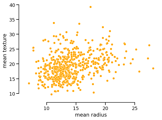
data_display.plot(kind="dist", x="mean radius", y="mean texture")

You can set the style of the plot via set_style() and then call plot():
data_display.set_style(scatterplot_kwargs={"color": "orange", "alpha": 1.0})
data_display.plot(kind="dist", x="mean radius", y="mean texture")
Export the underlying data as a DataFrame:
Metrics accessor: same idea, same display API#
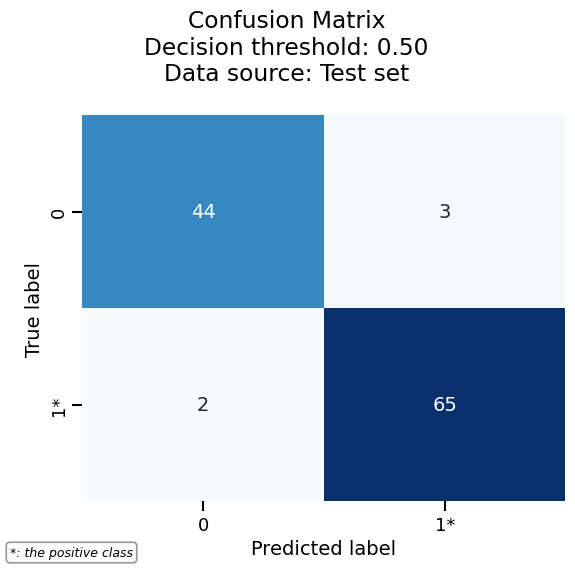
The metrics accessor exposes methods such as confusion_matrix(),
roc_curve(), precision_recall(), and prediction_error(). Each
returns a display (e.g. ConfusionMatrixDisplay) with the
same interface: plot(), frame(), set_style(), help().
metrics_display = report.metrics.confusion_matrix()
metrics_display.help()
Draw the confusion matrix by calling plot():
Inspection accessor#
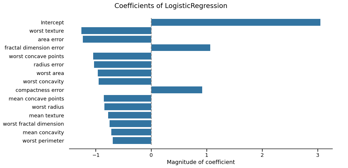
The inspection accessor exposes model-specific displays (e.g.
coefficients() for linear models, impurity_decrease() for trees).
These also return Display objects with the same plot(), frame(),
set_style(), and help() methods.
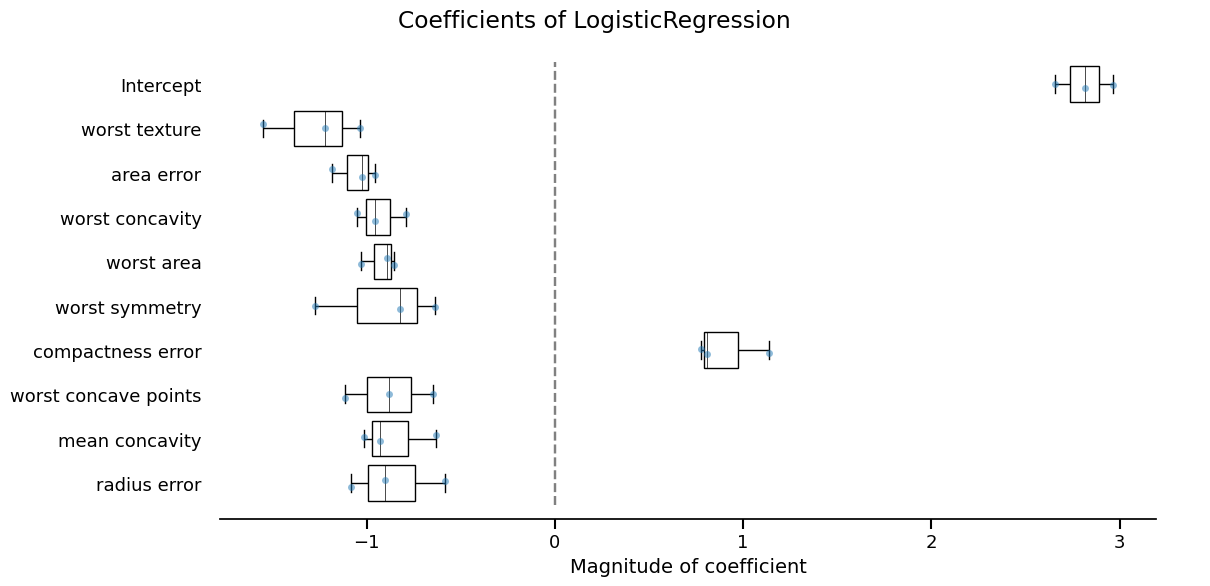
inspection_display = report.inspection.coefficients()
inspection_display.plot(select_k=15, sorting_order="descending")
Second report type: cross-validation#
Using the same evaluate() with an integer splitter returns a
CrossValidationReport. The same accessors and display API
apply; only the way the report was built changes.
Again: data, metrics, and inspection return displays with
plot(), frame(), and set_style().
cv_report.metrics.confusion_matrix().plot()
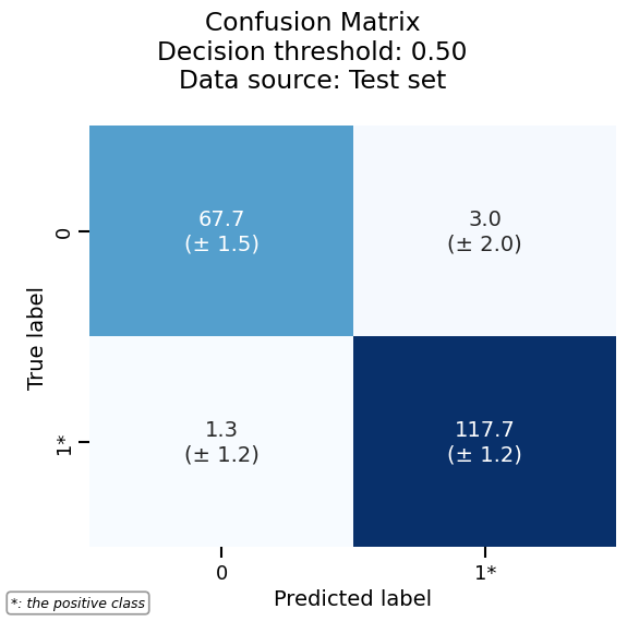
/home/runner/work/skore/skore/skore/venv/lib/python3.13/site-packages/skore/_sklearn/_plot/metrics/confusion_matrix.py:604: FutureWarning: The default of observed=False is deprecated and will be changed to True in a future version of pandas. Pass observed=False to retain current behavior or observed=True to adopt the future default and silence this warning.
  for _, group in self.confusion_matrix.groupby(["split"]):
cv_report.inspection.coefficients().plot(select_k=10, sorting_order="descending")
Third report type: comparison#
Passing a list of estimators to evaluate() returns a
ComparisonReport. It exposes the same metrics and
inspection accessors (no data accessor, since compared models can
use different datasets). The display API is unchanged.
Summary#
Three report types (
EstimatorReport,CrossValidationReport,ComparisonReport) are all created withevaluate()and share the same accessor layout:report.data,report.metrics,report.inspection(where applicable).Accessor methods that produce figures or tables return Display objects.
Displays share a single, predictable API:
plot(**kwargs)— render the visualizationframe(**kwargs)— return the data as apandas.DataFrameset_style(policy=..., **kwargs)— customize appearancehelp()— show available options
This consistency makes it easy to switch between report types and to reuse the same workflow across data, metrics, and inspection.
Total running time of the script: (0 minutes 8.301 seconds)